Design System & B2B Experience
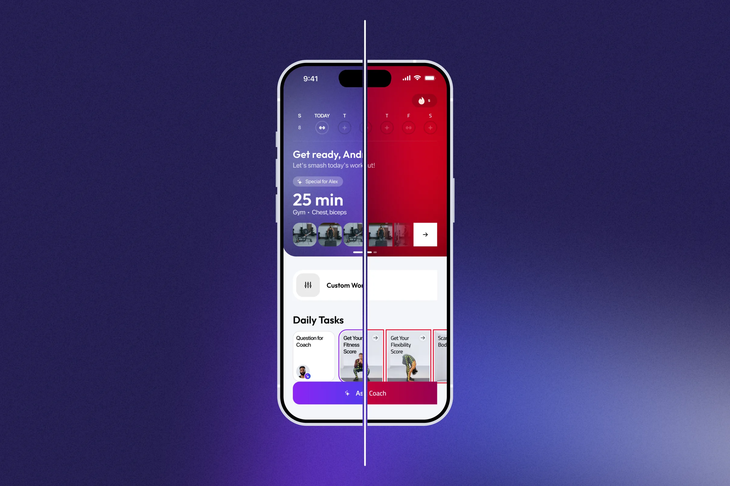
Zing started as one consumer app; then came web funnels, SDK screens inside partner products, a partner portal, and operational dashboards. Each new surface asked the same questions — brand, roles, density, states — and answering them screen by screen stopped scaling. I rebuilt the design system to answer them once.
- Role
- Product Design Lead
- Timeline
- 2021 — Now
- Contribution
- Design Systems, B2B SDK, Operational UX
Key numbers
What the system carries, and what it changed about shipping.
- ×4
- Screen assembly speed
- ~80%
- Built from the system
- 5
- Surfaces, one system
More surfaces, more inconsistency
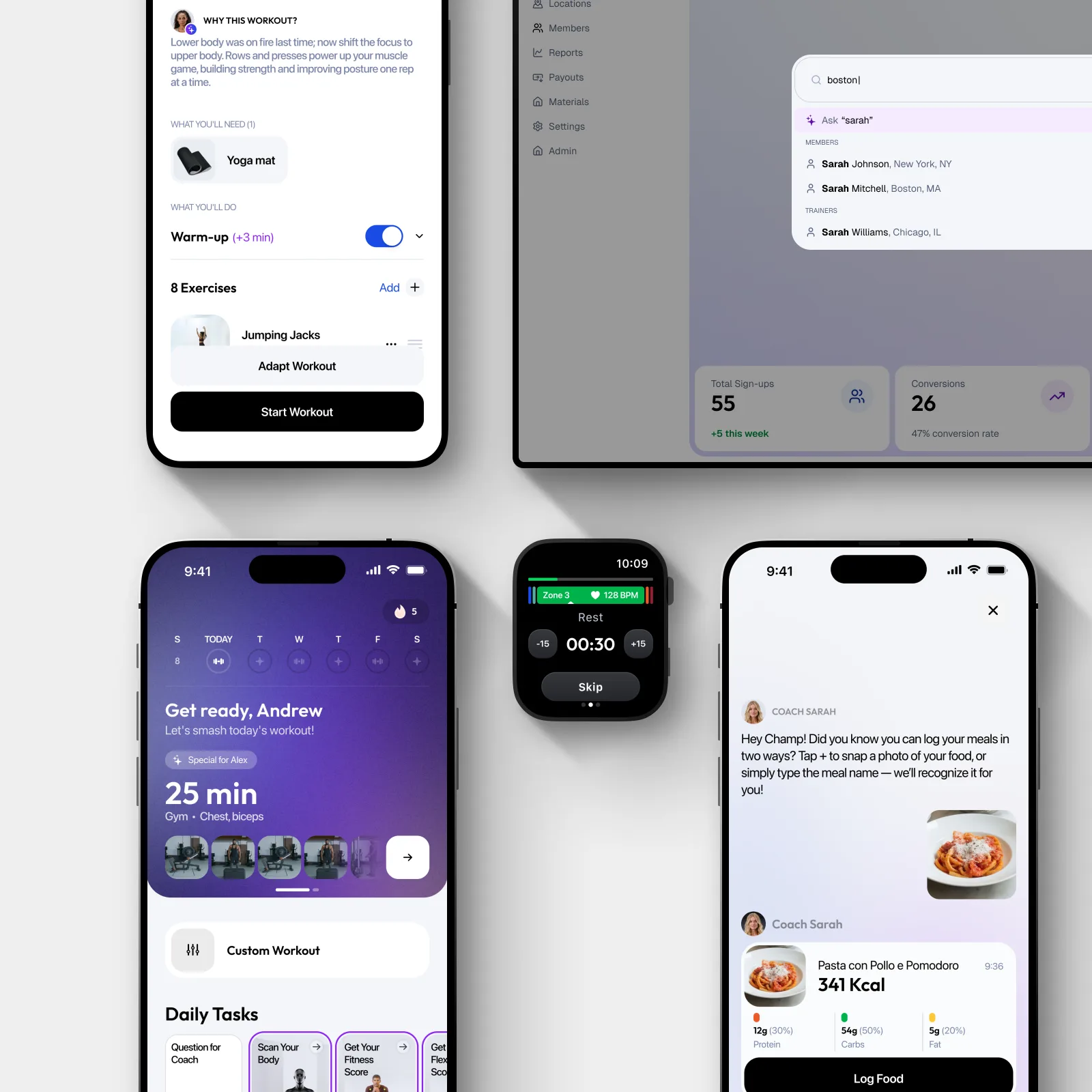
As the product grew, the same decisions started appearing in four different contexts. The consumer app needed motivation, habit-building, and polished mobile flows. Growth pages needed speed and reusable conversion blocks. SDK screens needed theming and predictable behavior inside another product. The partner portal needed dense, role-based operational UX.
Designed screen by screen, every new surface drifted: slower to ship, harder to hand off, inconsistent within a quarter. Which decisions should be made once — and which have to stay per-context?
System before screens
I treated the design system as product infrastructure, not a component library: reusable where the decision repeats, flexible where the user context changes.
In practice that meant four layers — foundations, components, patterns, templates — each answering a bigger question than the last: what things look like, how they behave, how a flow works, how a whole surface assembles. A new landing page or a partner dashboard started from a template and inherited every decision below it, instead of starting from a blank frame.
A partner-ready design system
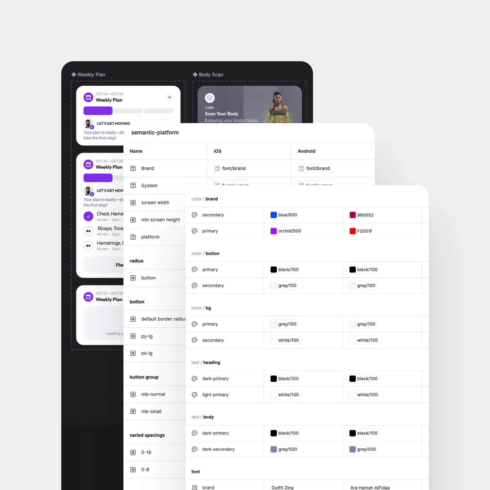
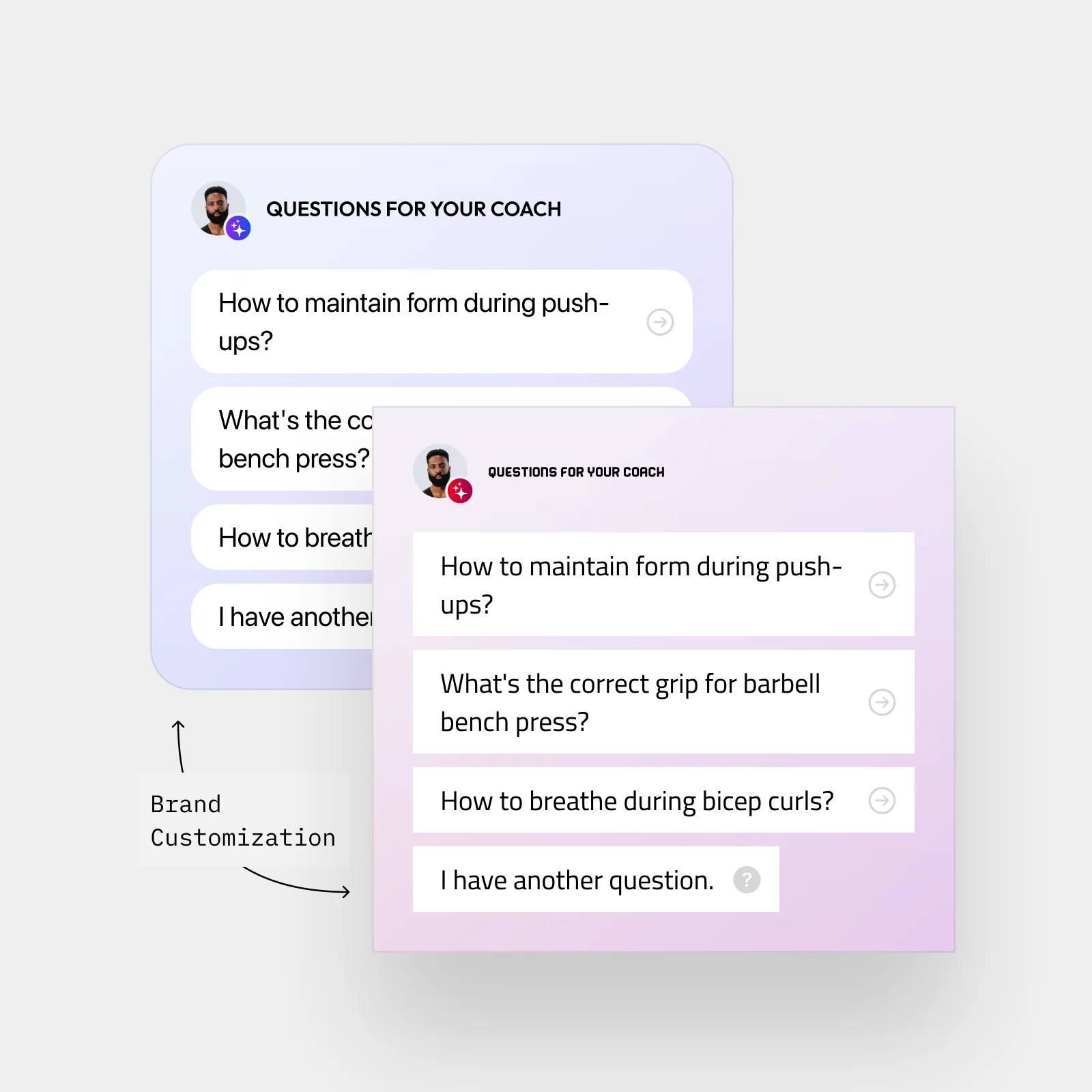
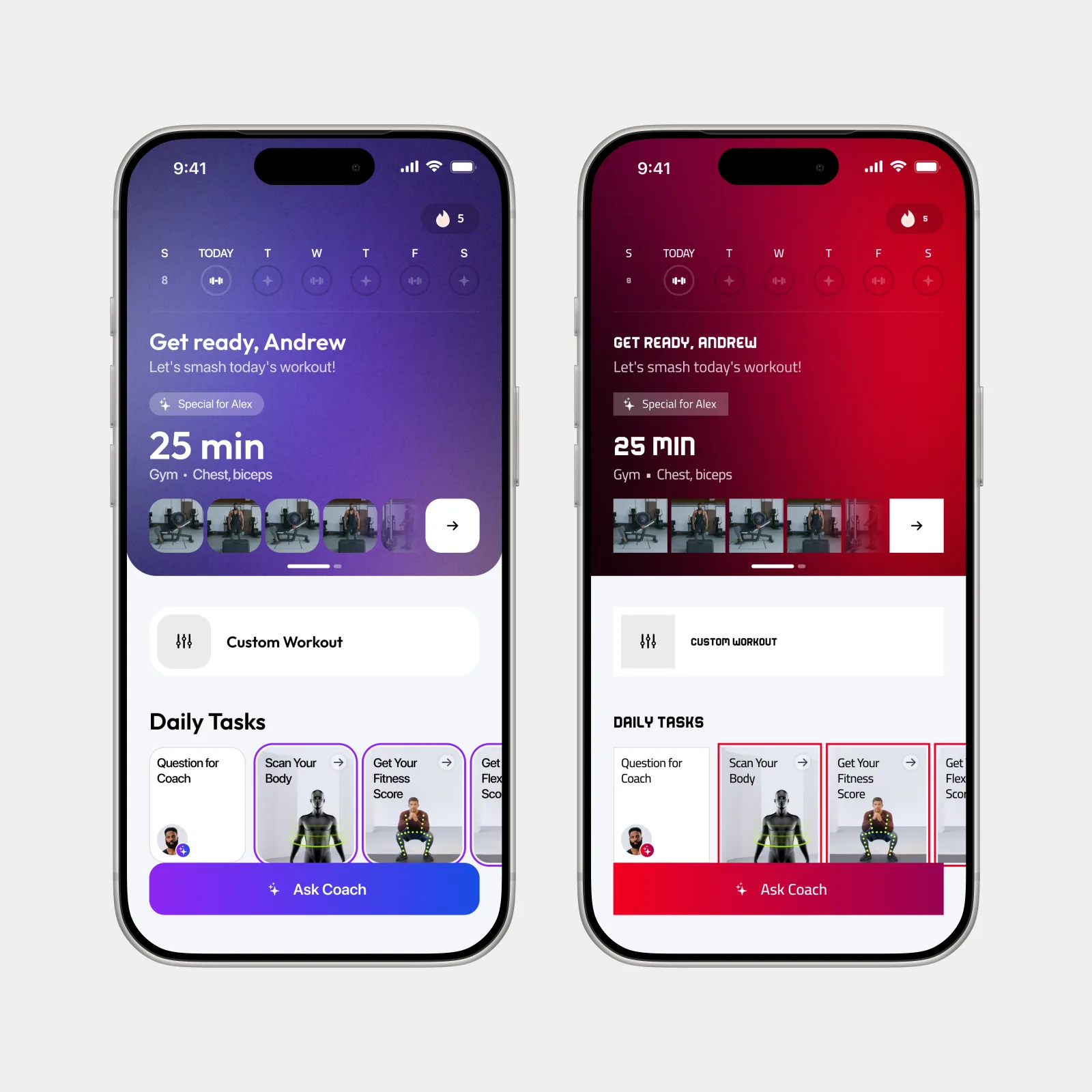
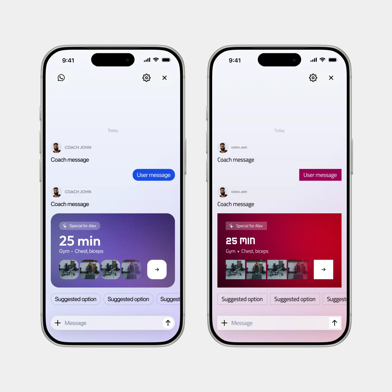
B2B SDK pushed the system further. The same product experience had to support Zing defaults and partner-branded versions without redesigning every screen.
We moved the system from visual styles to semantic tokens — an action, a surface, a text role — so a partner rebrand became a token swap. The brand layer changed hands; layout and core behavior stayed ours.
Operational UX
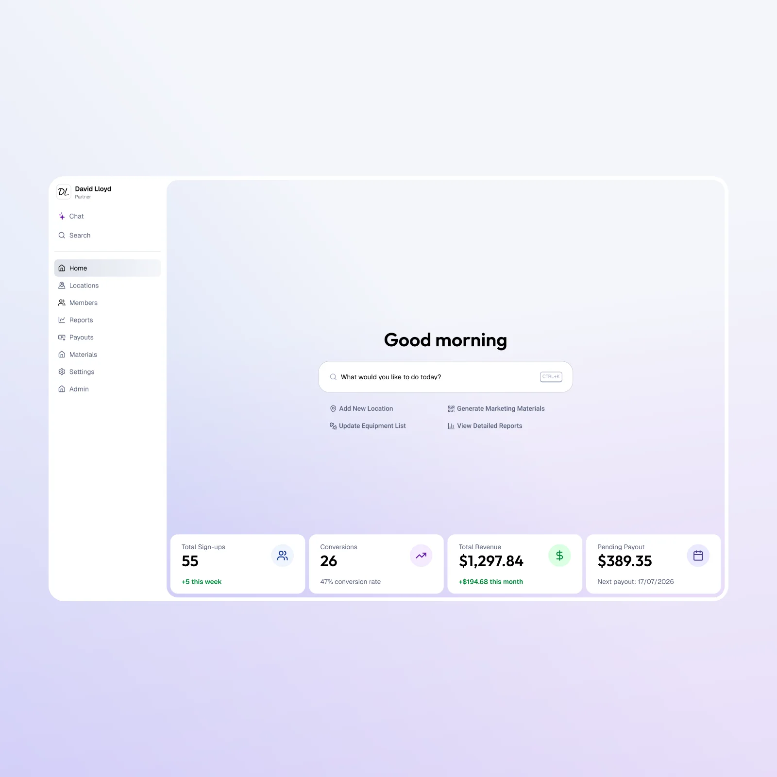
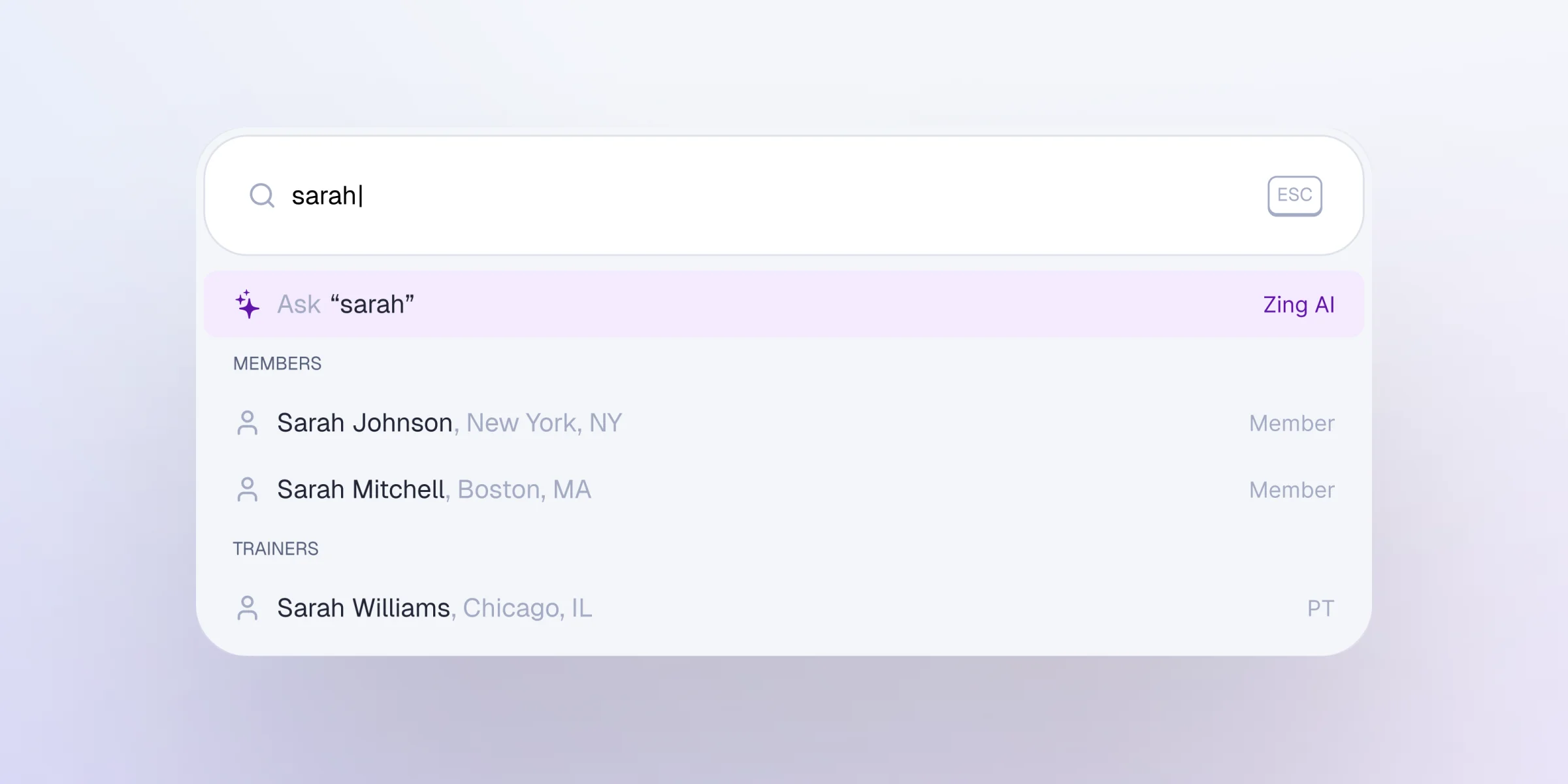
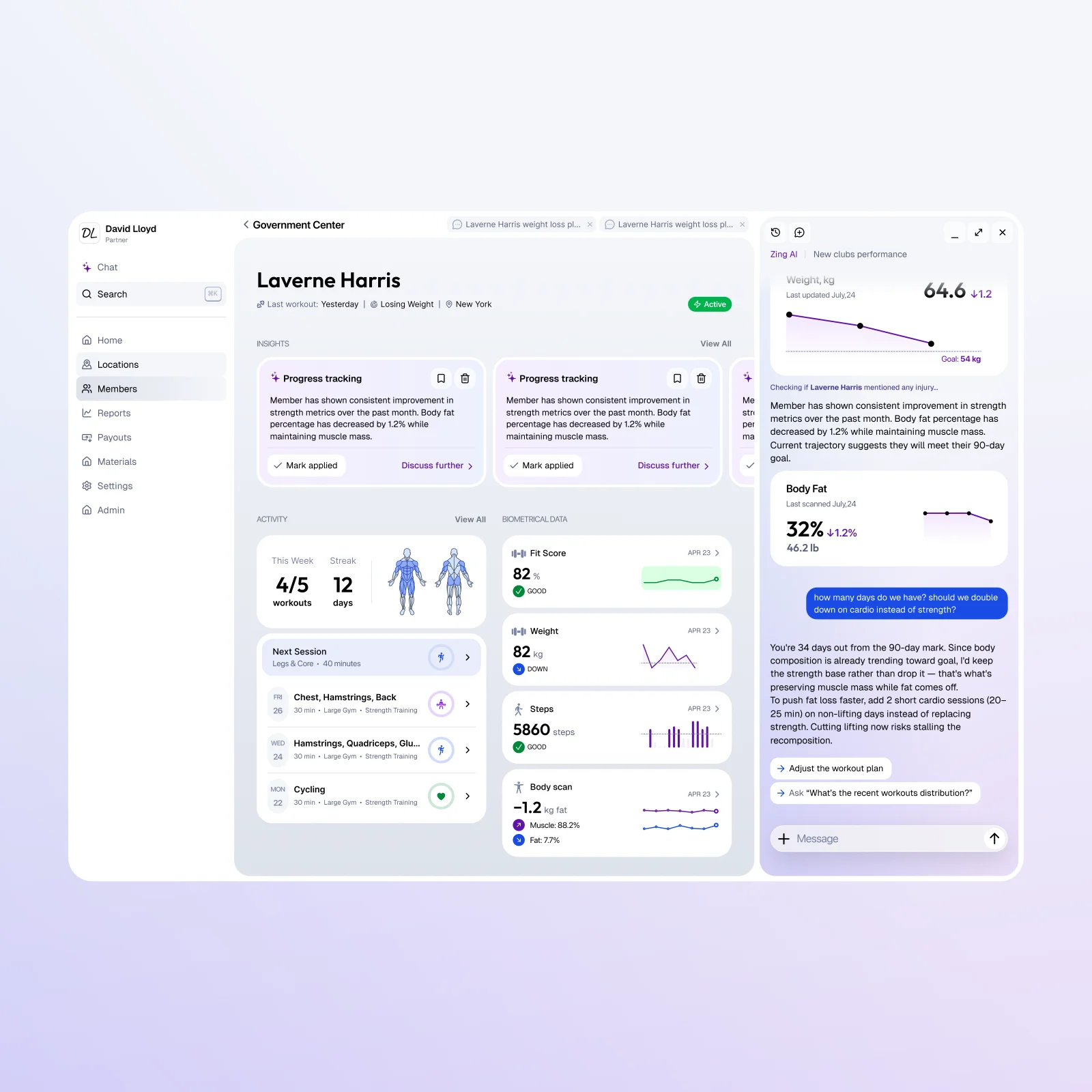
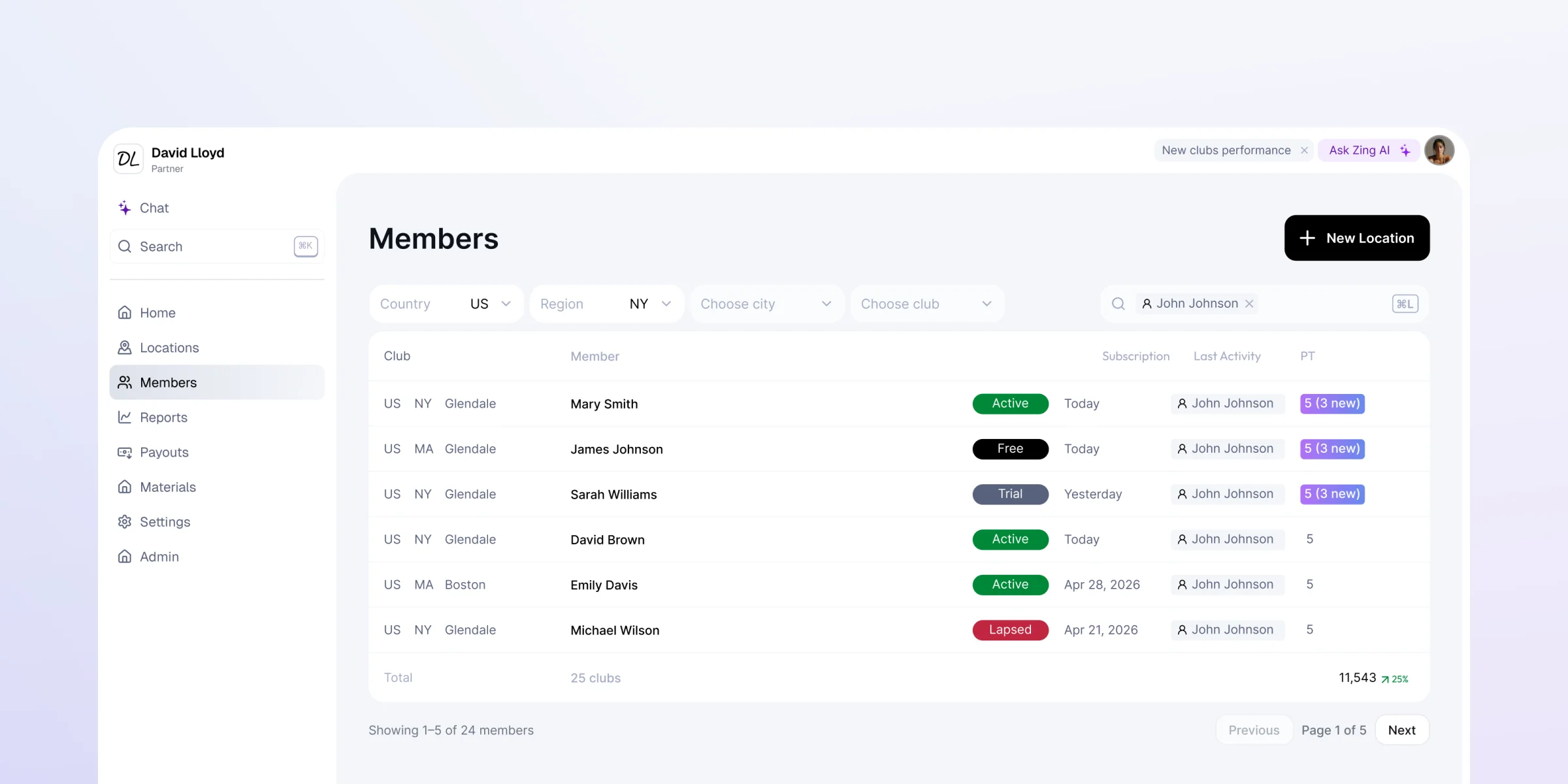
The partner portal flipped the unit of design: instead of one user completing one workout, multiple roles manage many users — locations, payouts, reports, permissions.
The system grew a second register for that density: predictable tables, filters, role-aware navigation, and empty states that say what is missing and who can fix it. Operational screens earn their keep by being scannable and comparable — the opposite bar from a paywall.
What this taught me
A design system pays off in proportion to product complexity. At one surface, it keeps screens consistent. Across many, it is what lets a new surface launch without renegotiating the product language: the system already knows what stays stable, what changes per context, and what day one inherits.