DriveAssist
Atlant-M — the largest car dealership holding in the CIS — sells, finances, and services cars, and for decades did it almost entirely offline. DriveAssist was its bet on a digital future: one platform where a customer can buy or sell a car, take financing, book service, and see it all in one account. I worked on UX and UI design across the platform as part of the product design team.
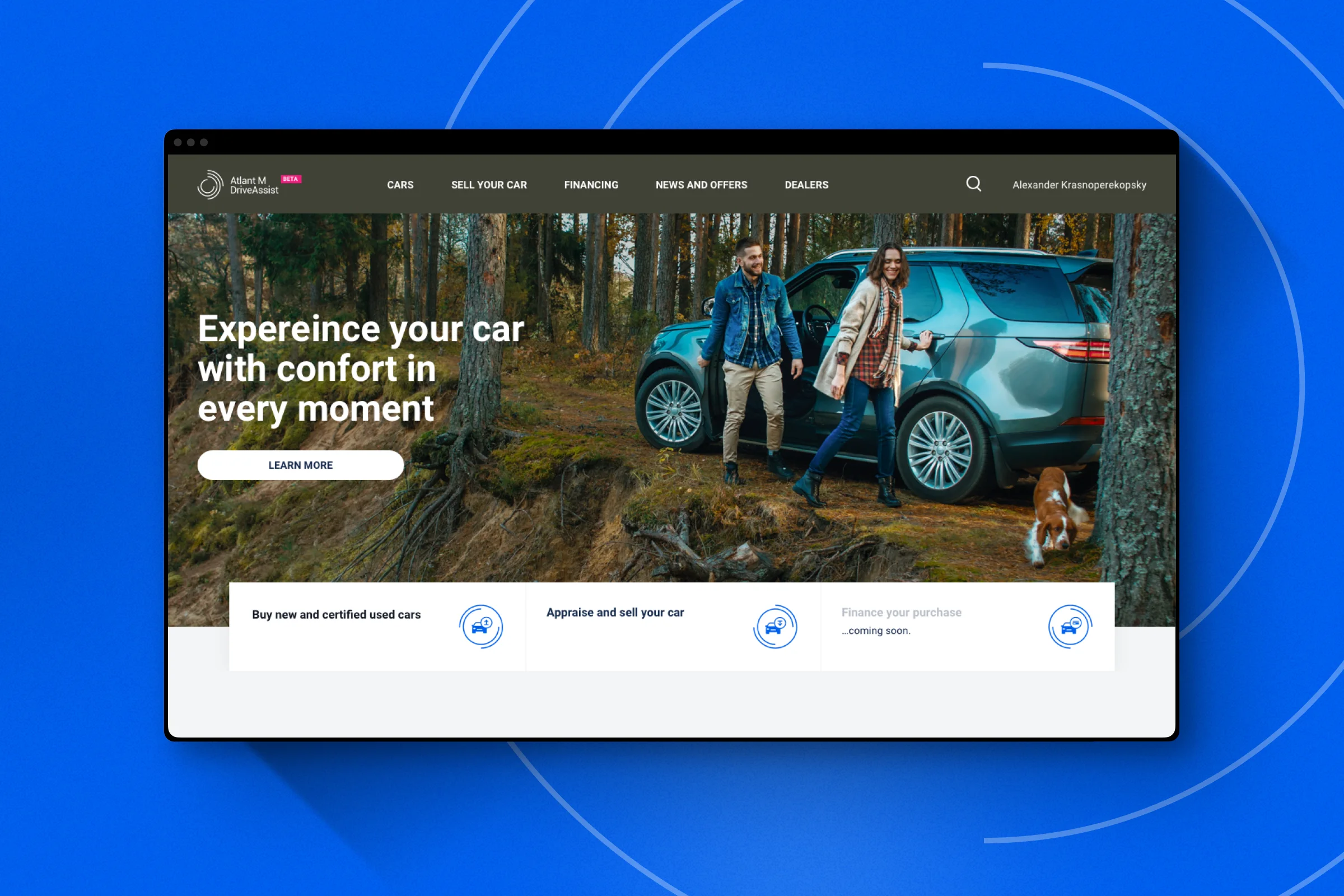
- Role
- UX & UI Design
- Timeline
- 2019
- Contribution
- Automotive, E-commerce, UI Design
Key numbers
What the platform moved within four months of launch.
- +80%
- User-to-lead conversion
- +30%
- Sessions per user
- ×2.4
- Organic and direct traffic
A marketplace that feels like a boutique
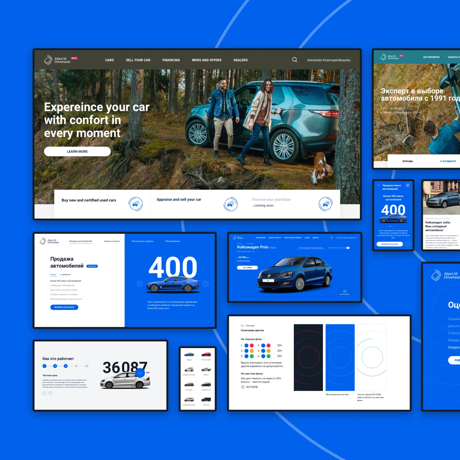
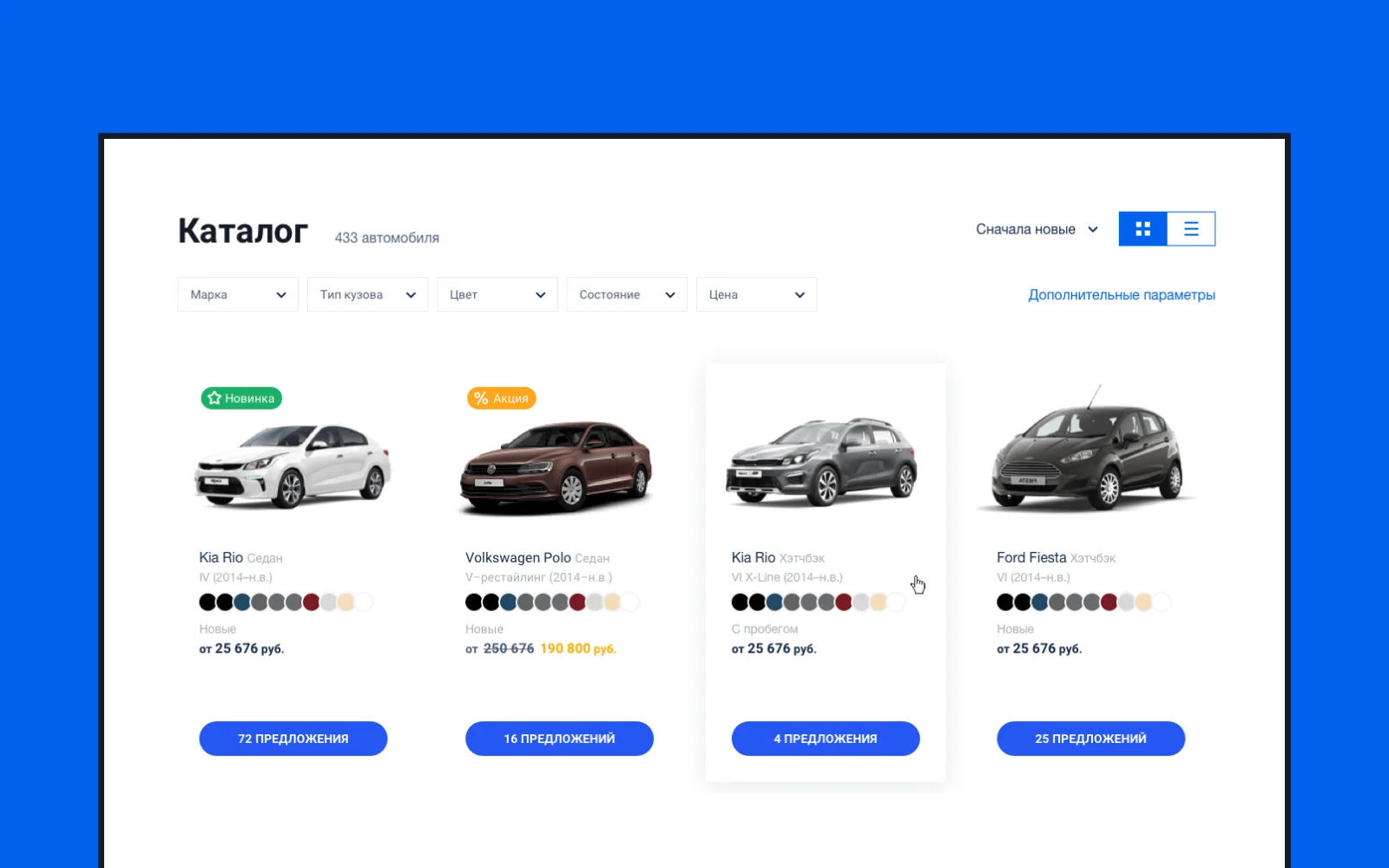
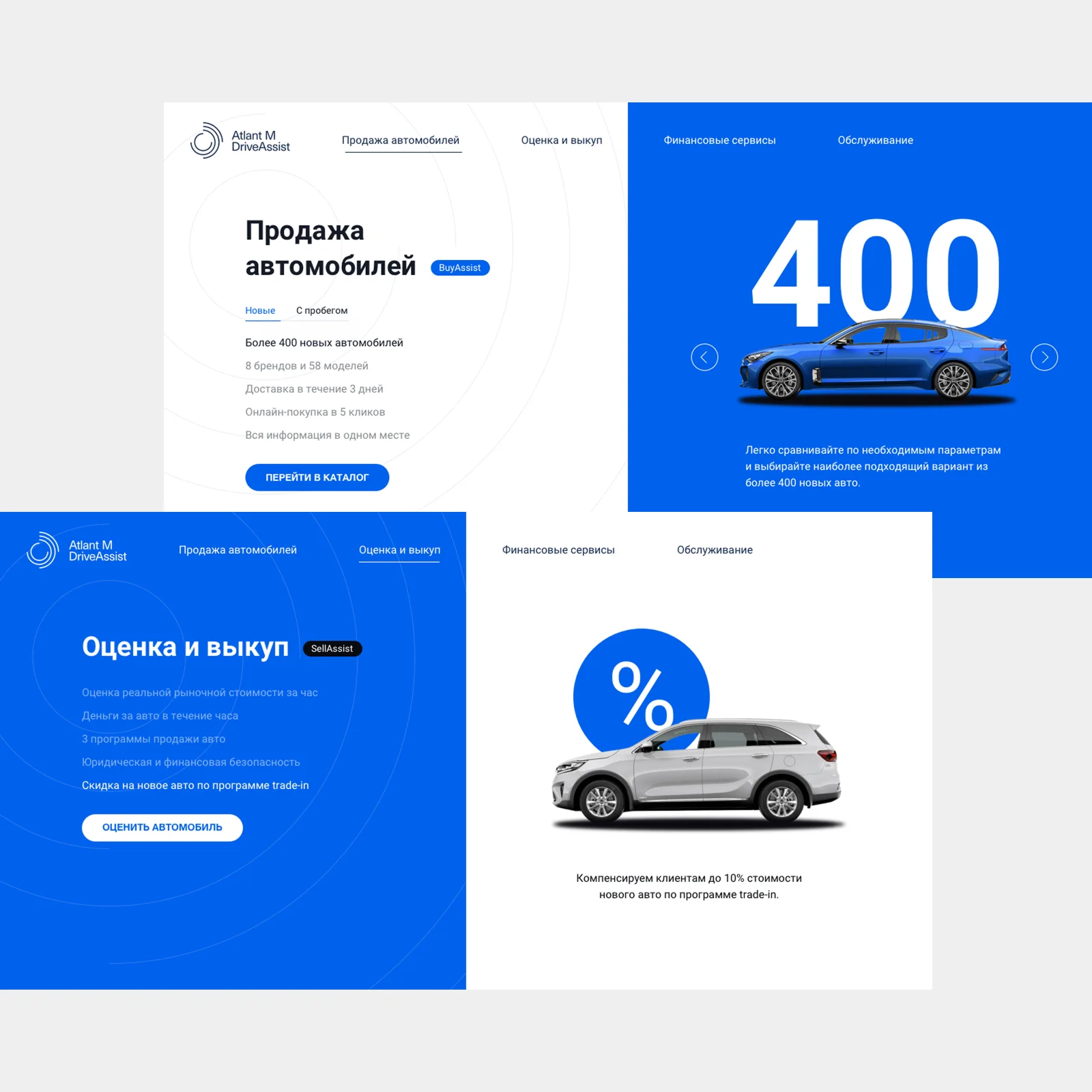
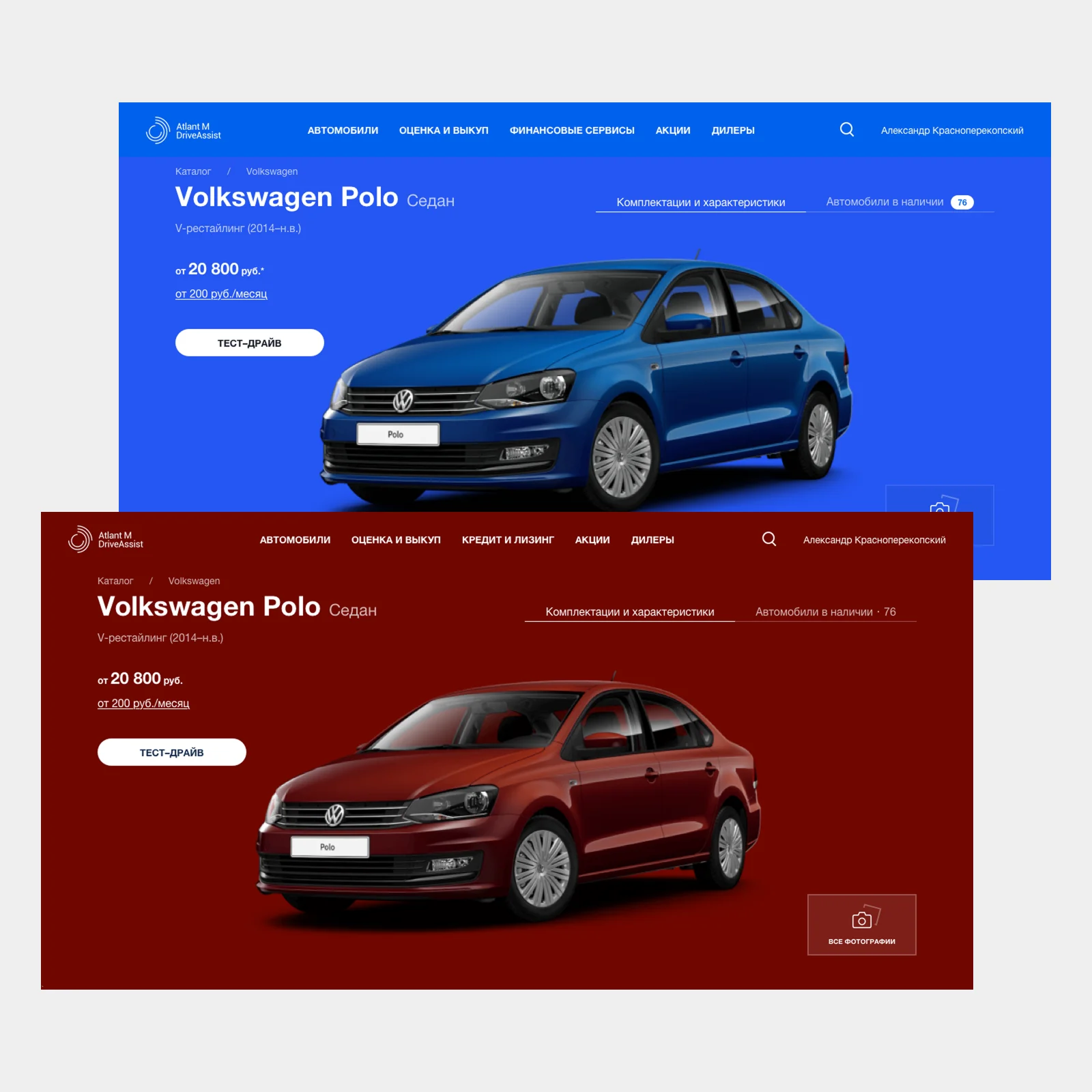
DriveAssist had to hold a four-figure inventory of cars and still feel like a curated storefront, not a classifieds board. I collapsed the catalog into a Make → Model → Generation → Body structure, so discovery starts from the car people picture in their head — not from a wall of filters — and every model card stays ready to sell.
I connected the services around it — buying, selling, financing, equipment, service — into one hyper-linked system: wherever a customer enters, every next step is one link away, with no dead ends between services.
Closer to buying an apartment than a laptop
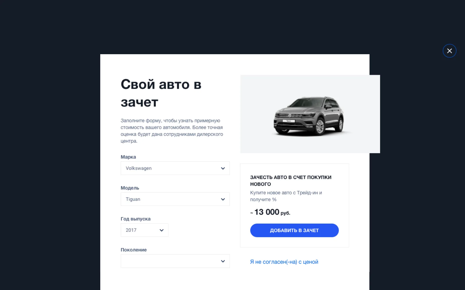
A car purchase is a web of interdependencies: with a trade-in, the final price is unknown until the old car passes appraisal — and until then there is no credit, insurance, or delivery to configure. My answer was to split the flow in two: ordering, where the customer defines scope in a few clicks, and processing, where appraisal, financing, and paperwork run over days with visible statuses.
I designed the order as a set of components — appraisal, credit, insurance, delivery, payment — each with its own status and structure, so the customer stays informed of every change and can amend, upsell, or pay online at any point.
A system that survives any screen
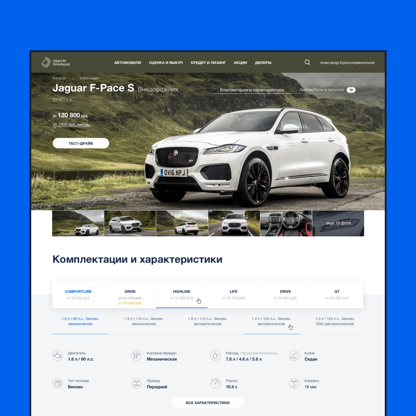
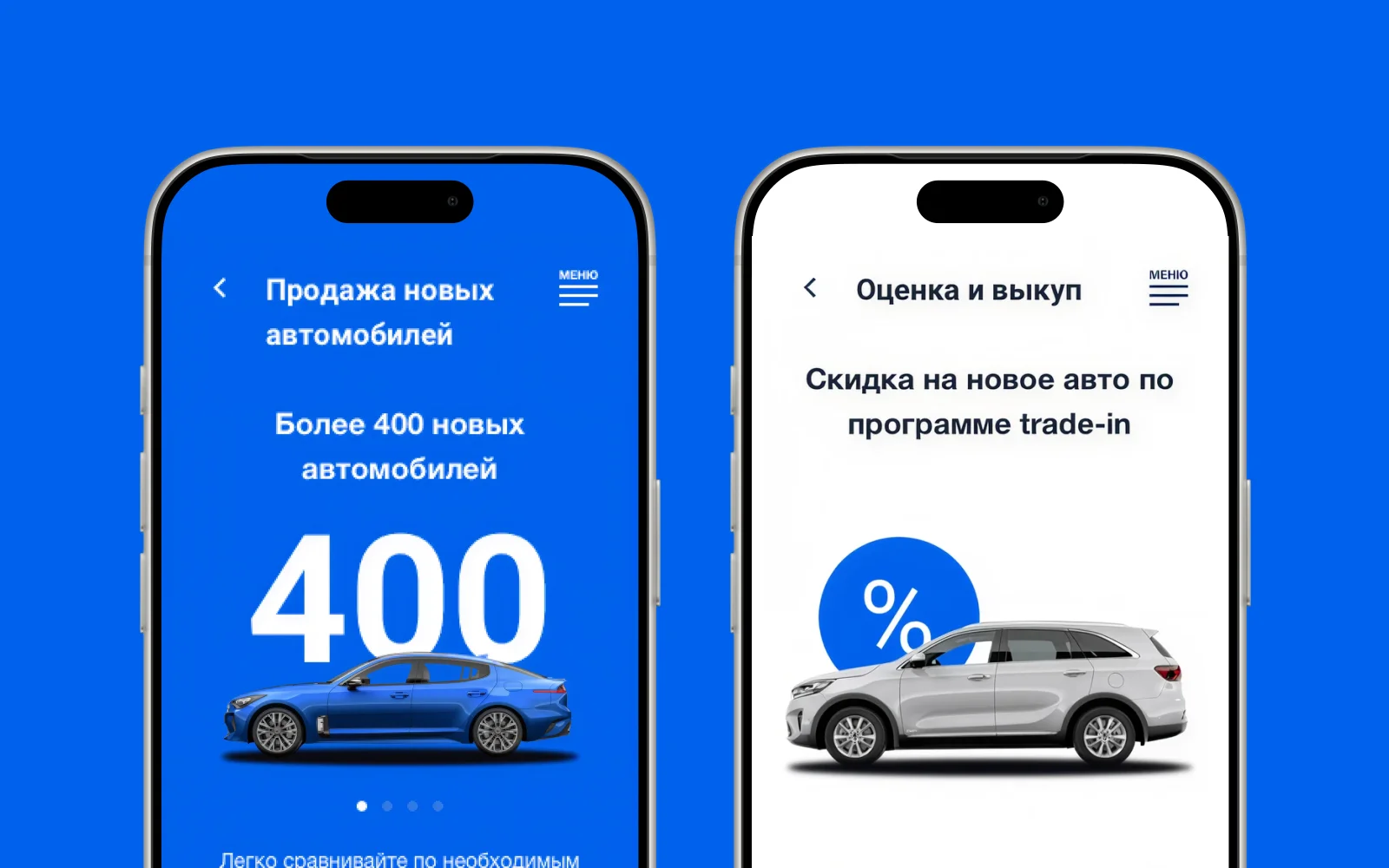
I designed within a system of variable breakpoints: components respond independently instead of snapping the whole page, which keeps layouts alive on any resolution. The same system carried the quieter craft I cared about most — a chameleon header that adapts its color to any hero imagery, a curated car-color library that keeps catalog cards neat, and an email and SMS guide so even a payment notification speaks in the service's voice.
Measured like a product, not a launch
The platform ran as a product with a feedback loop, not a website that ships once. An evaluation plan defined what, how, and when to measure — do people buy, book, and appraise cars; where the main flows drop off; whether the experience feels right. A measurement plan wired analytics into every screen, insights fed the roadmap in a continuous research loop — and my design decisions answered to those numbers.
What this taught me
Considered purchases need two speeds: let people decide in minutes and let the process take the days it legally needs — as long as every status is visible. And a marketplace does not have to look like one: structure the catalog around how people think, and a thousand cars can feel like a boutique.