Consumer Finance Portal
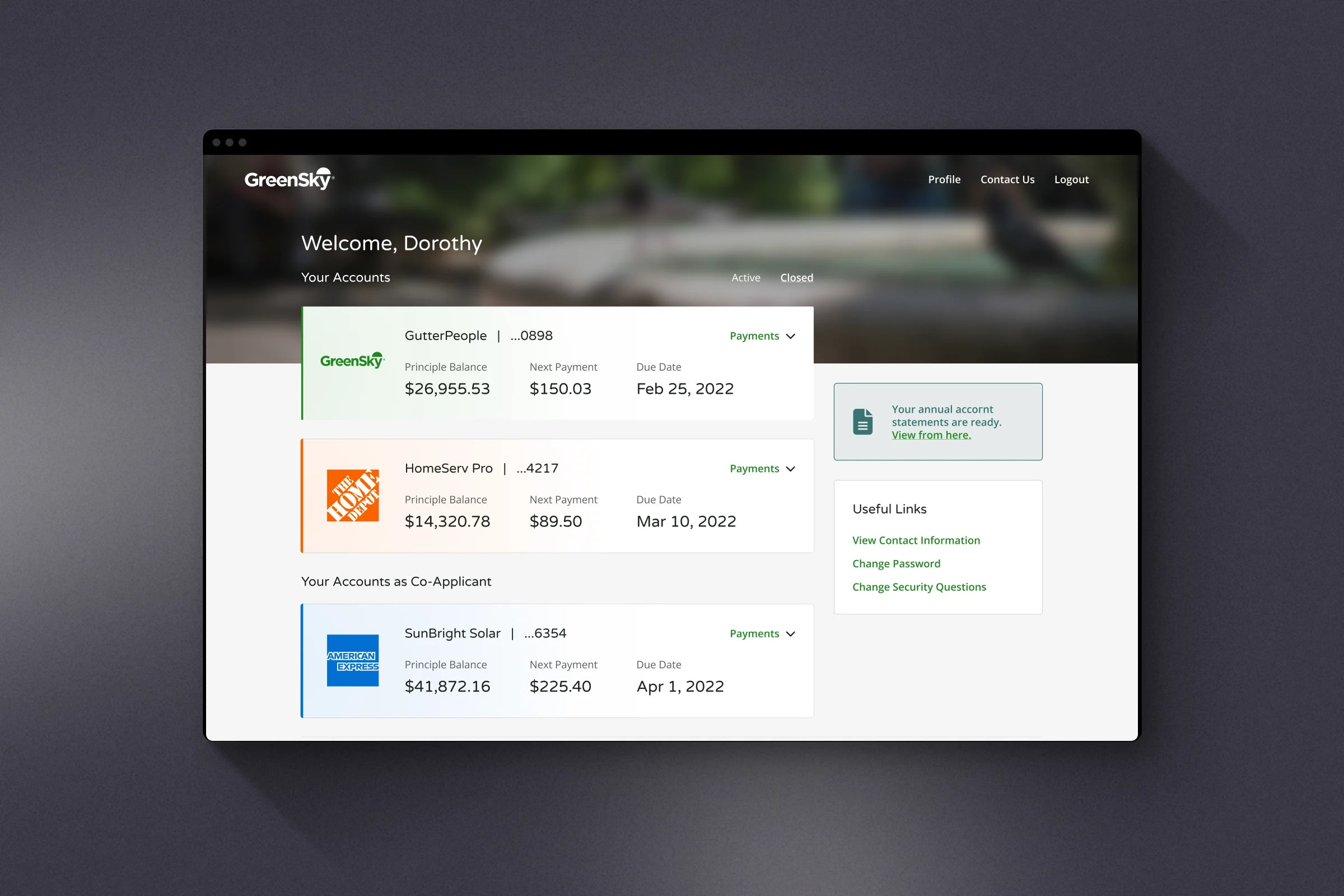
A GreenSky loan starts at the kitchen table: a contractor offers financing, the customer signs in minutes and gets back to the renovation. Then comes the hard part — years of living with that loan. GreenSky services these loans for a dozen banks, and borrowers had no clear window into their own credit. I designed the consumer self-service portal that became that window.
- Role
- Product Design Lead
- Timeline
- 2019 — 2020
- Contribution
- Fintech UX, Research, Design Systems
Key numbers
The scale behind the portal — and how borrower behavior changed after launch.
- 1M+
- Home improvement projects financed
- 12+
- Banks in the program
- 11 wks
- Kick-off to launch
A loan with a hidden deadline
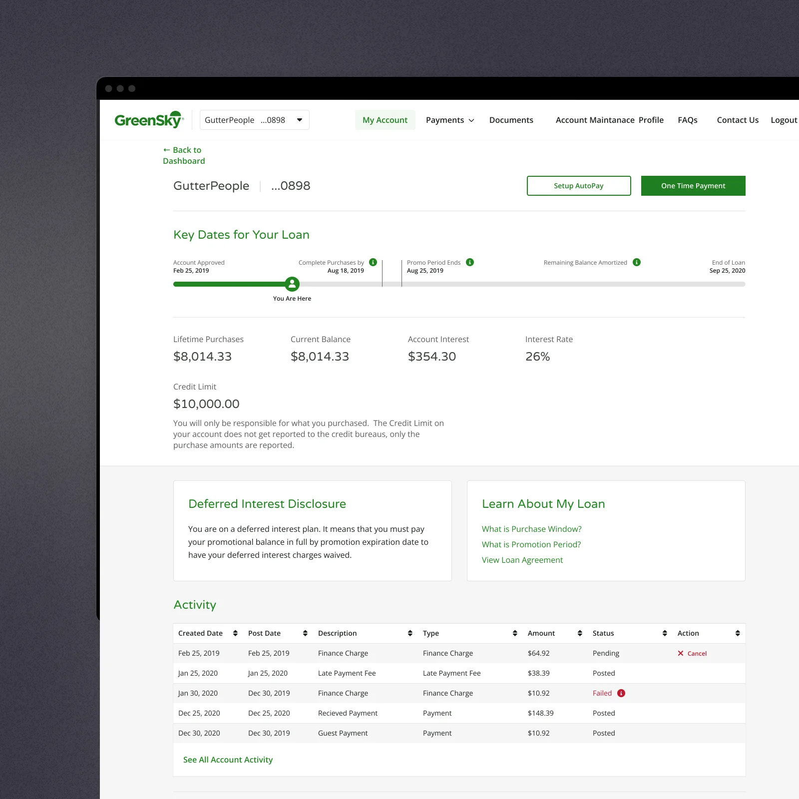
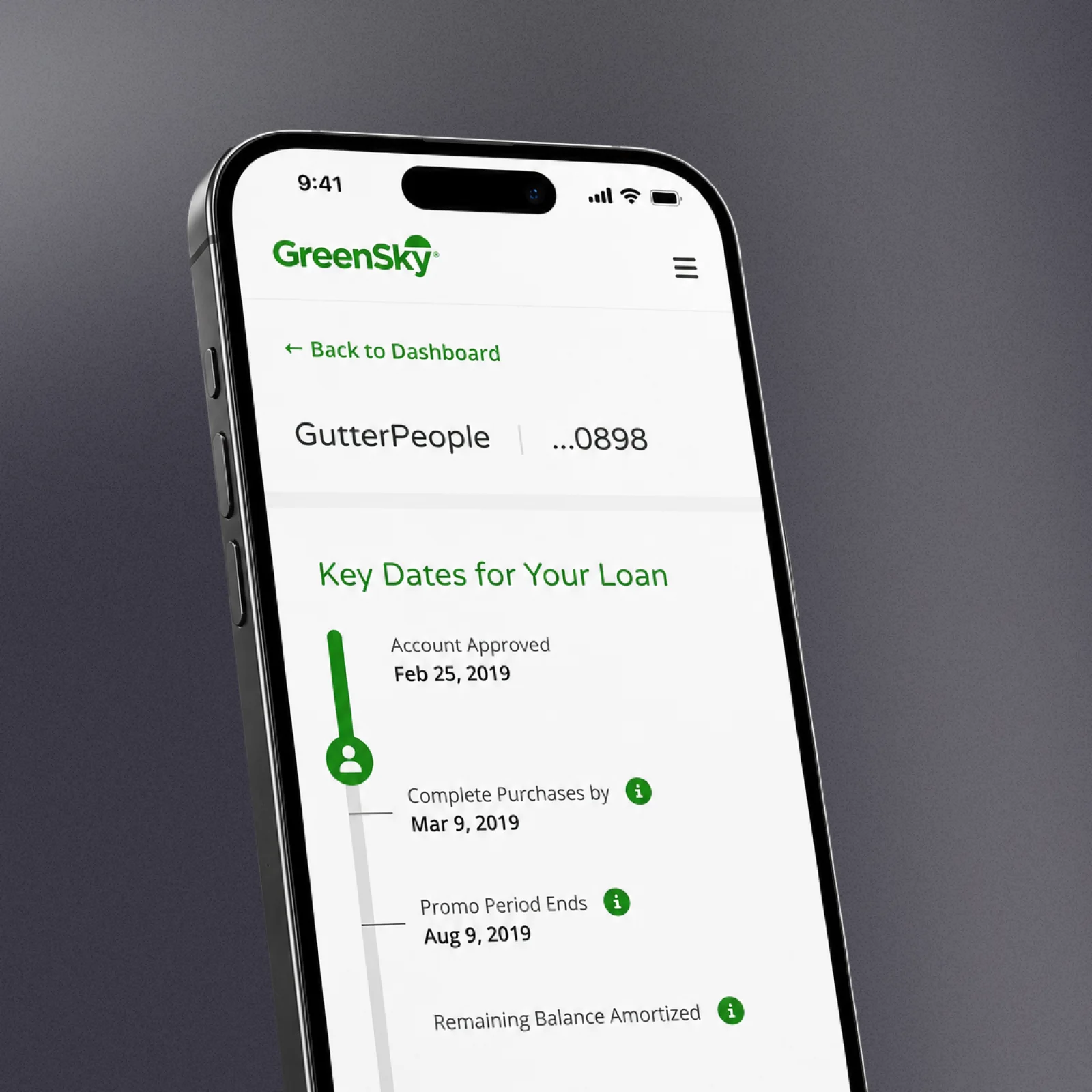
Most GreenSky loans come with a promotional window: pay off the balance in time and the deferred interest is waived, miss the date and it lands on the account all at once. Borrowers signed at the kitchen table, not at a bank desk — many did not know their dates until the interest hit, and the ones who worried called support to ask questions the account should have answered.
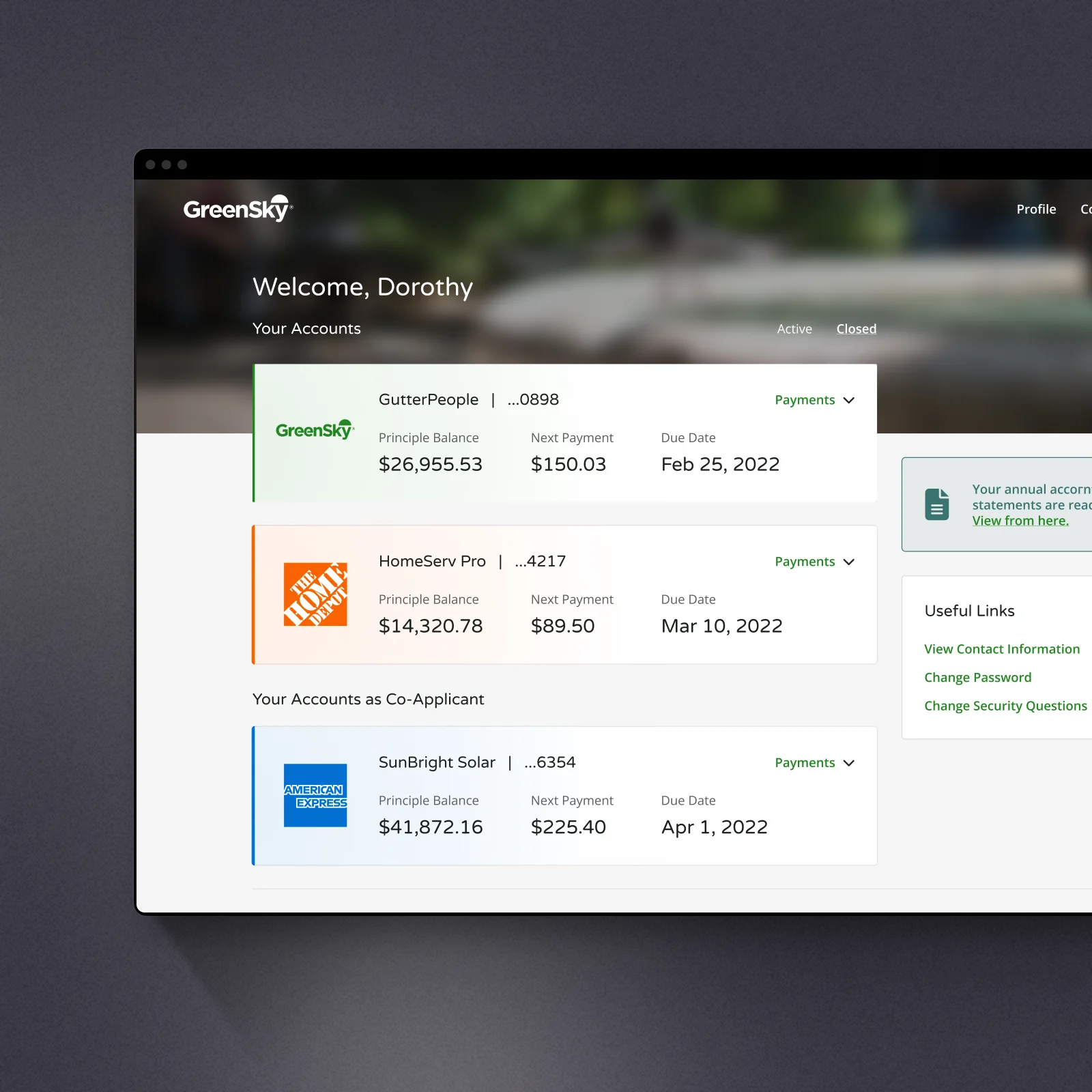
I designed the account around one object: a timeline of the loan. Approval, purchase window, promo expiration, payoff — one axis with a "you are here" marker, deferred-interest terms explained next to it in plain language, not in a disclosure PDF.
Evidence before wireframes
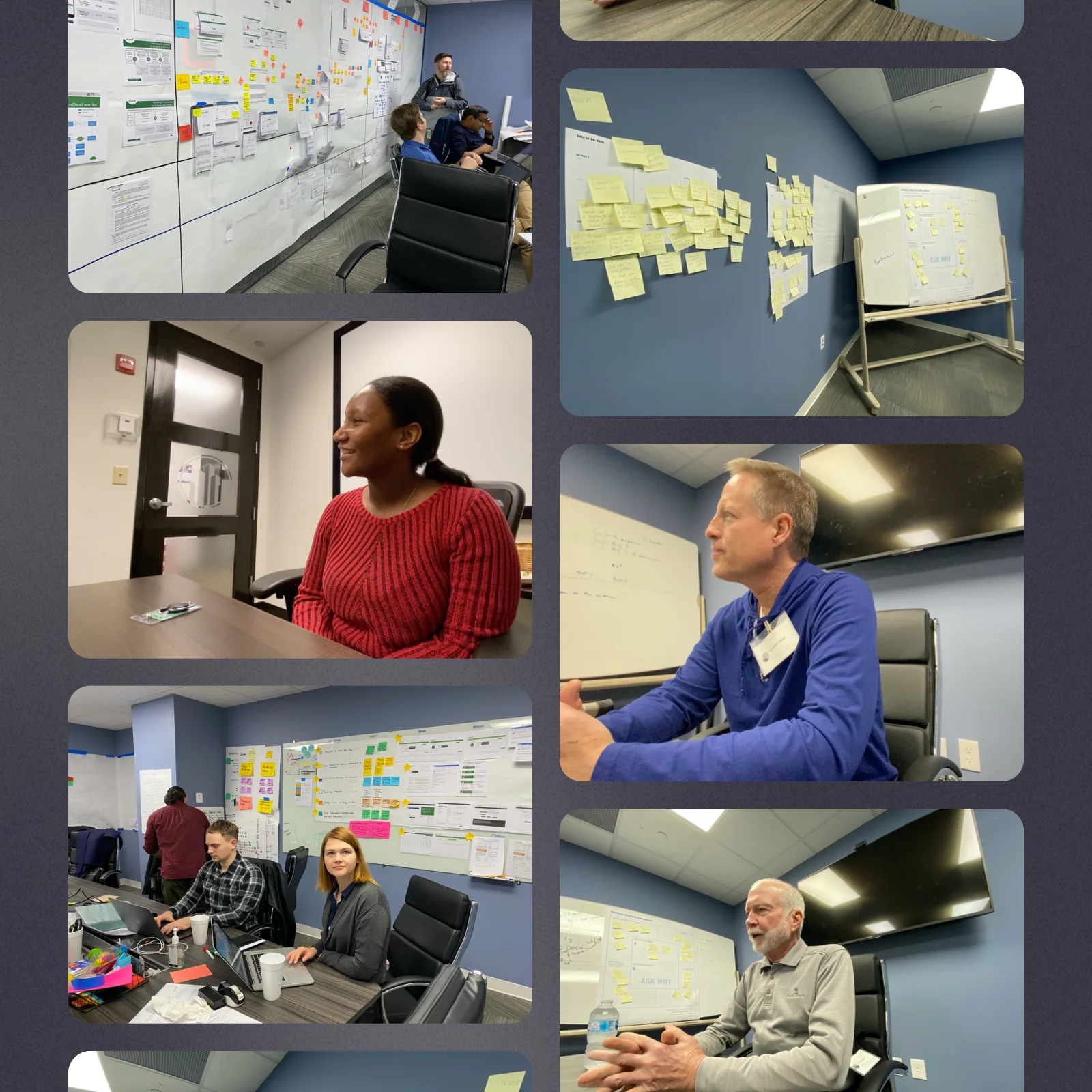
Discovery ran wider than user interviews. Stakeholder workshops aligned the whole program on shared goals and measurable success criteria; journey mapping traced every touchpoint a borrower meets — statements, emails, the phone line; competitive teardowns showed where the industry bar already stood.
The richest source sat one floor away: the call center team, whose logs turn every confusing statement and surprising date into a searchable record of pain. By the time design started, I knew which problems actually cost money — and had the baseline data to prove the redesign moved them.
Every decision shipped with a metric
In a regulated product you cannot ship a guess. Every design decision ran as a hypothesis: prototyped cheaply, tested with borrowers, then A/B-tested live where the stakes allowed. Analytics were part of the design rather than an afterthought — each screen launched with its measurement plan, so within weeks the team knew whether a change earned its place. Polish came last, after the behavior was proven.
Enrollment without the drop-off
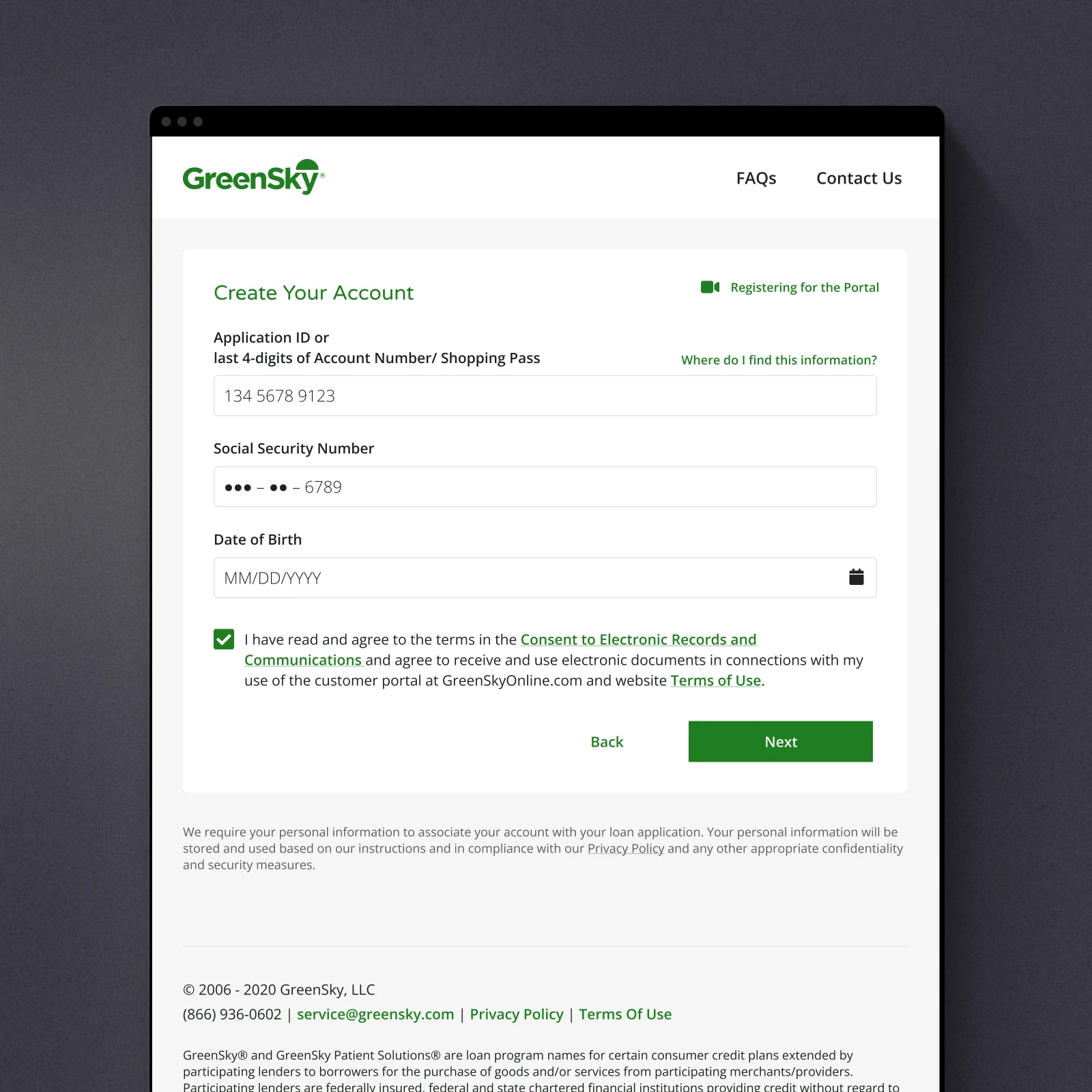
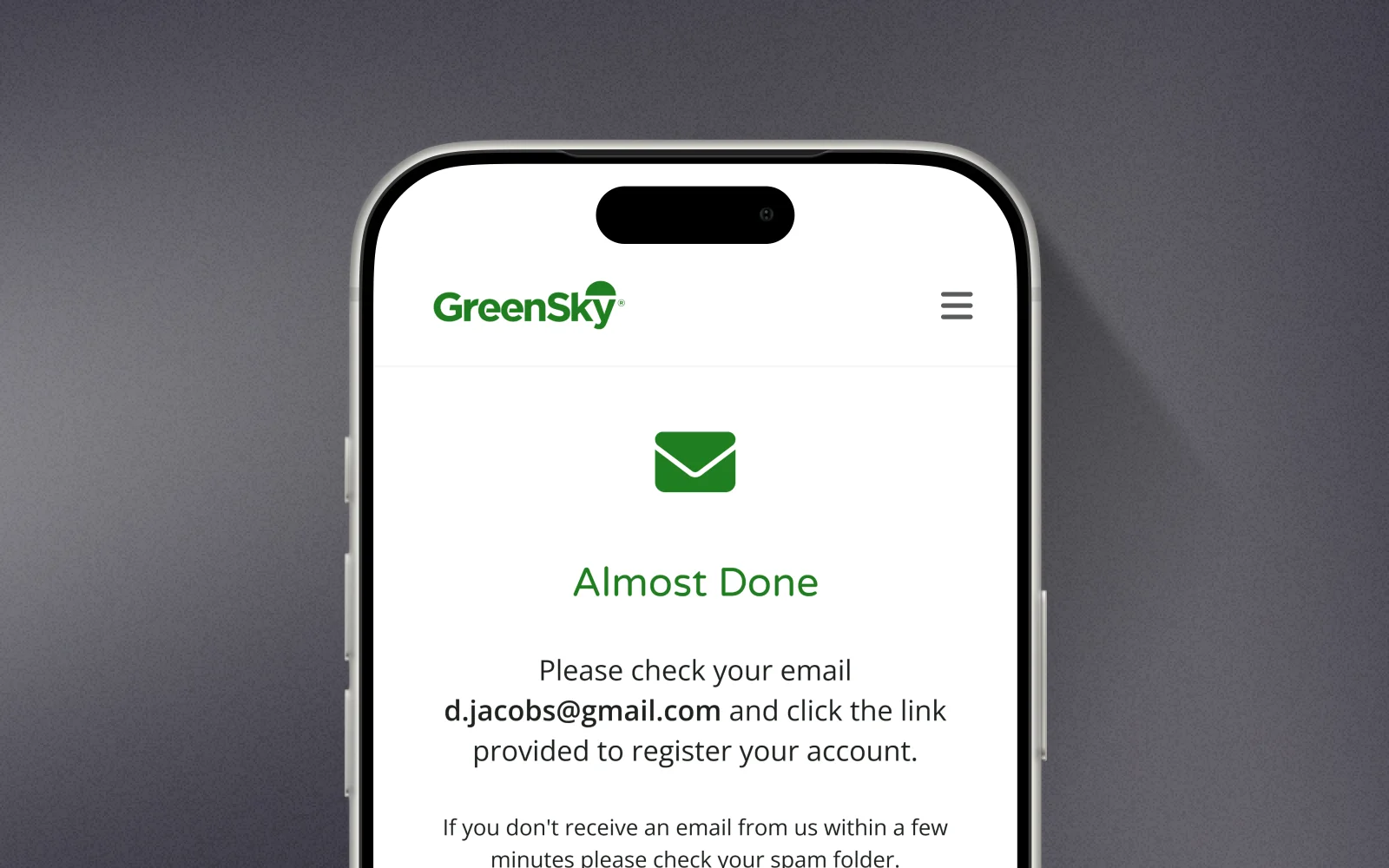
The old registration lost almost half of the borrowers who started it — identity checks built for compliance, not for humans. I rebuilt the flow around the data borrowers actually have at hand, moved the hard questions later, and explained why each step exists.
44% → 71%
Registration completion
Self-serve instead of the call center
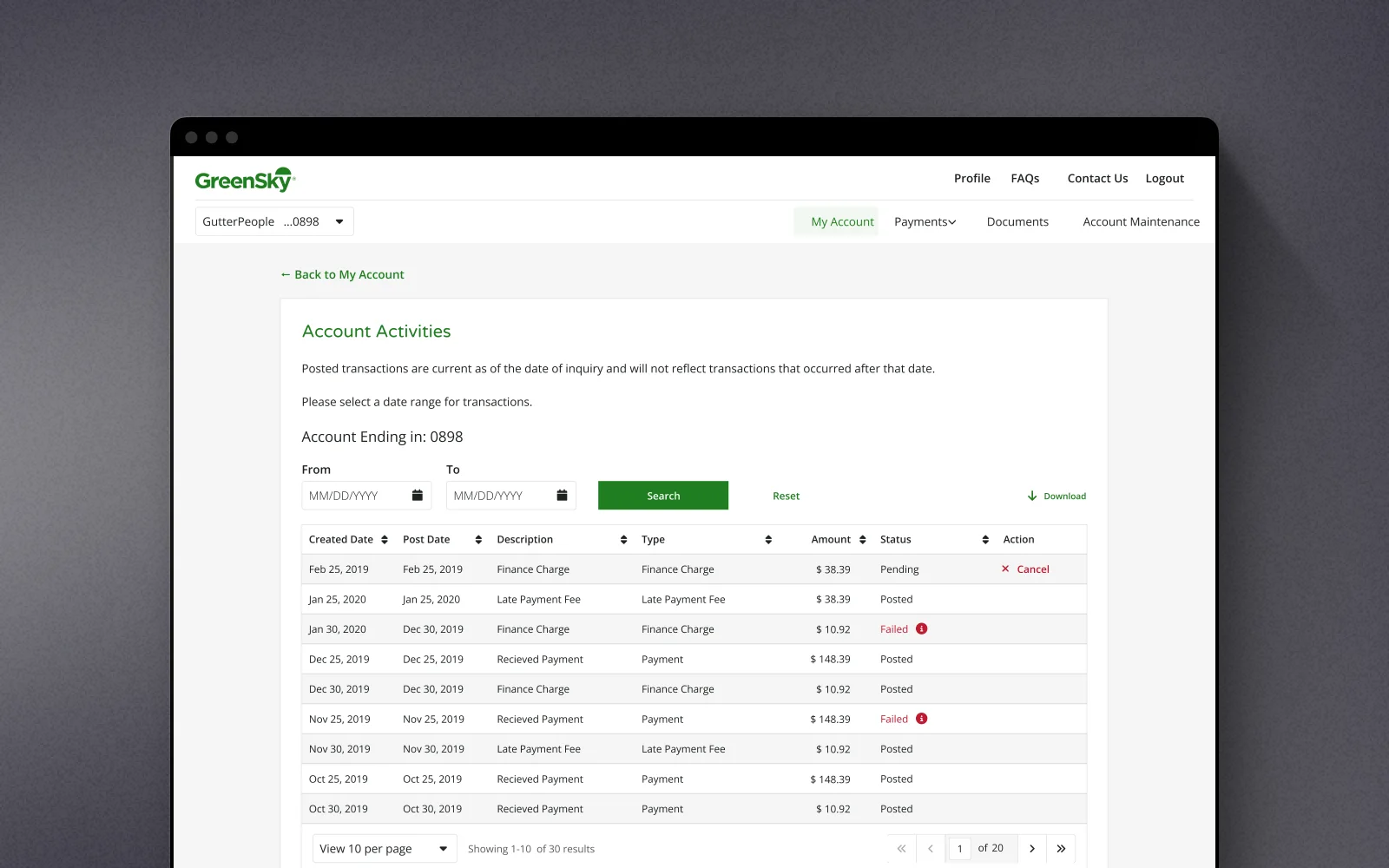
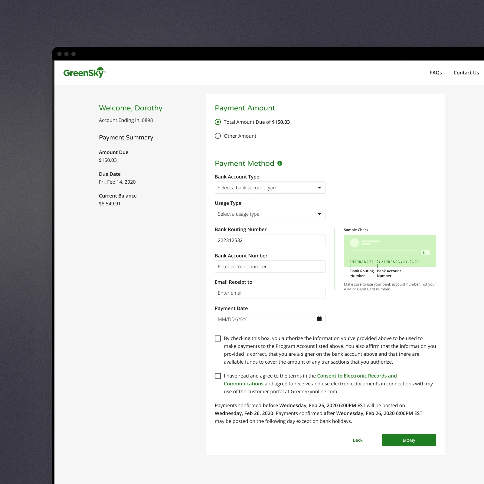
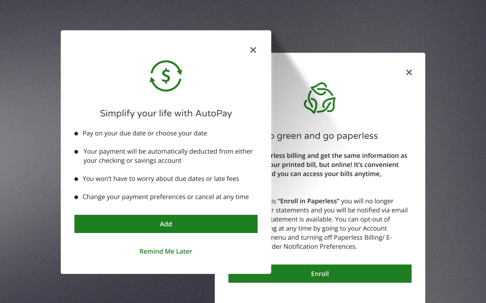
Every payment made online and every statement read in the portal is a call that never happens. AutoPay and paperless enrollment moved into the main flows instead of hiding in settings, and payments became a two-step action from the dashboard.
×1.8
AutoPay and paperless enrollment
−27%
Servicing calls per account
One portal, every merchant's brand
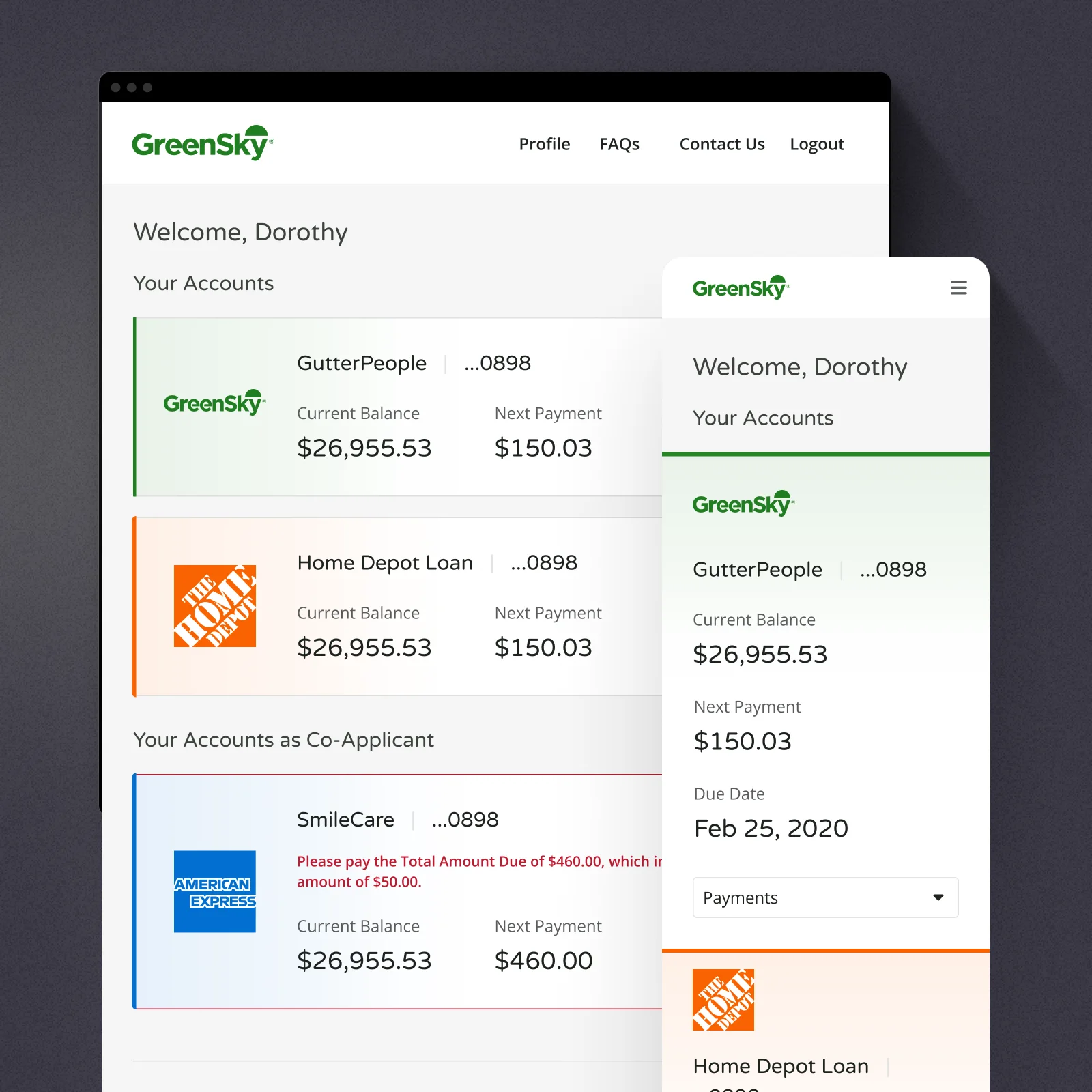
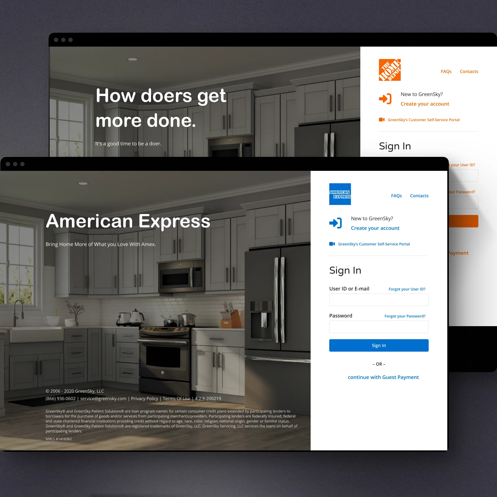
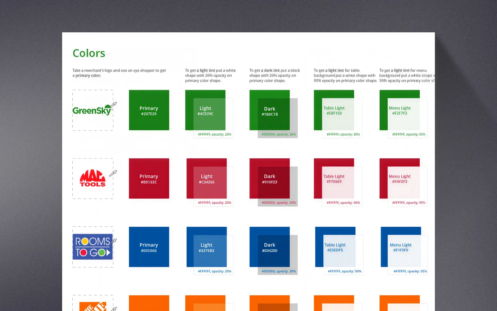
Borrowers do not think of their loan as a GreenSky product — they got it at Home Depot, at the dentist, from the roofing company. The design system carried that: branding rules let the same portal wear each merchant's identity, from logos to color ramps, while components, states, and behavior stayed one source of truth. In a regulated product, that consistency is not cosmetics — it is how legal disclosures stay correct across every branded instance.
What this taught me
Fintech UX is won with clarity, not features. A borrower opens a loan portal six times a year, usually slightly worried — the design's job is to answer the question they came with before they have to ask it. And the most valuable research often sits one floor away, in the call center logs.